 My first attempt looked like this--------------------------------->
But I wasn't satisfied with how blocky it was, and no matter how much I played with the "ribbon", made up of rectangle and half square triangle pieces, I couldn't get it to look right.
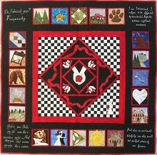
But having everything revolving around a central Eclipse was something that I liked.
In the previous two quilts, it frustrated me that we had to narrow down to only a couple of quotes. But this done for good reasons: one they were embroidered, so they had to be big enough to be feasible; and two the blocks were the star of the show. But I love Stephenie's characters and so much of what they say. If I could, I'd have the whole Saga quoted on my walls! Recently I've been experimenting with printing on fabric, both the "printable fabric" you can buy, and making my own, and I thought this would be a great way to incorporate more quotes since they can be smaller and still be legible.

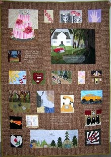
 So I thought, why not make the whole quilt look like a scrapbook page: the Eclipse book cover as the "background"; the appliqued Eclipse as an "embellishment"; the blocks as the "photos"; and the pertinent quotes as the "journaling". Here was attempt#2 -------------------->
They were the only designs submitted by our deadline and we put them up for vote. Someone suggested changing the polaroid effect for a framed photo with a separate jouraling tag under each, which has a much cleaner, sophisticated look. And thus the design evolved to this (with temporary "sample" blocks):

(and for some good Photoshop tips!)
Iris
~~~~


1 comment:
Iris, your design is just gorgeous. I loved 'reliving' it a bit and hearing more about your creative process. You really did a fantastic job with this quilt!
xo -E
Post a Comment