February 14, 2011

Twilighty Fabric Postcards

Why don't you sit with me today? –Edward Cullen, Twilight, page 87

I thought it might be fun to send Twilight-themed fabric postcards to my fellow Twi-hards. I used this tutorial, with a few minor alterations. I finished my outer edges differently {she did a satin stitch, I used pinking shears}. And I used Pellon Peltex 72F II double-sided fusible stablizer instead of the non-fusible Peltex to save on Heat 'n Bond to fuse the front and back to the Peltex. I still used Heat 'n Bond to fuse the additional fabric elements on top. For the pictures, I used fusible ink-jet fabric sheets.

These are for the few who are Team Jacob. I used these as an opportunity to to a little free-motion quilting practice. I did pebbles across the brown strip. The first one wasn't much fun, but I'd gotten into a groove by the second one. My original plan was to quilt in a birthday wish using the character's font from the book, but after spending well over an hour on the first one, I changed my mind. This cute little paw print fabric I used for the background came from Angie.

These are for the girls who are Team Switzerland. Again, I did a little FMQ practice — horizontal straight lines on the background, a few flourishes at the corners of the pictures and some elongated loops across the burgundy strip. Sorry about the fuzzy picture.

And these are the Team Edward postcards. I found this fabulous batik with the apples on sale on-line, six or eight months ago and bought a yard, wondering what fabulous project I could make with it. LOVE it for these postcards! The red Moda Marbles came from Wanda. I quilted swirly scrolls along the red accent strip and did flourishes or frames around the picture.

More postcards for Team Edward. I did the same quilting on these; swirly scrolls on the accent strip and frames around the pictures.

Our group is predominantly Team Edward. Iris sent me that gorgeous gold fabric I used for the accent strips. Nothing too original with the quilting on these — elongated loops across the gold strips and flourishes on the pictures. I also did vertical straight-line quilting on the backgrounds for these.

I did stippling on the red background and just a straight stitch across the black accent strip. That fabric is some of the tiny bit I have left from the quilt we made for Stephenie Meyer. I love the swirls in it.

I love this picture of Bella and Edward. I kind of went with what I knew for the quilting and did elongated loops across the burgundy accent strip and flourishes on the pictures.

And this is my absolute favorite — Edward in the meadow. Wanda found the background fabric and sent a little bit to everyone in our group who wanted some. It goes perfectly with this picture. I did little flowers across the accent strips and flourishes at the corners of the pictures.

And there you have it. Fifteen Twilighty fabric post cards.

August 26, 2010

A Home for the Eclipse Quilt

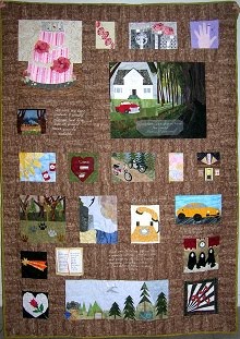
Desiree Brugman was the winner of our Eclipse Charity Quilt. She dropped us a line to let us know the quilt arrived safely. Her initial reaction was priceless. She said:
My daughter Maddie's reaction was, "Its huge! It's so pretty!" And all Meagan could say was, "Wow mom!" As for me, all I could do was smile and touch it. It's absolutely breath taking!

She sent us another note with a photo of her girls holding the quilt and we'd like to share that with you.
We were thrilled with the quilt! You can't just call it a quilt though, its a true piece of art. The girls and I have looked at and touched each square. The work that was put into it is amazing. Of course we each have our favorite square. Mine is the imprinting, Maddie's is Rosalie's and Meagan likes the tent scene. My husband couldn't pick just one; he liked the whole quilt, but was real impressed with the ribbon that runs through it. We're going to use it as a wall hanging over our sofa. That way everyone can enjoy it. I am still amazed we won this. We can't wait to see what you girls come up with for Breaking Dawn (we're anxious to see the movie too!). Thanks so much for the quilt and your love of Twilight. I'm proud to say yes, I am one of those Twilight people, a Twilight Mom as a matter of fact!

Congratulations to Desiree and her girls, Maddie and Meagan! We would also like to thank every one who donated to Alex's Lemonade Stand Foundation. We believe it is an important cause.

August 9, 2010

And the winner is.....

We would like to congratulate Desiree Brugman, along with her daughters Maddie (9 yo) and Meagan (8yo) from Texas on winning the Eclipse Quilt!

Once again thanks to everyone who participated in our Eclipse Give-To-Win.  Thank you for your support and your interest.  


~~~ 

August 7, 2010

Stephenie Meyer talks about our quilt!!!

Yesterday Twilight Lexicon posted part of the Eclipse Junket interview done by Twifans.com where Stephenie Meyer says the quilt we gifted her, Piece, Love, Twilight, is lovely!!!!

Letters to Twilight posed the question: So what have you been given where you’re, like, “Oh! Okay…that’s interesting…”

Stephenie's response: What’s the weirdest thing I’ve been given? I been given some really amazing stuff, because someone gave me a quilt that…….I mean, I don’t have words. It’s amazing. Each square was made by someone different. And they depict scenes from different scenes from the book. And it’s lovely.

Here is the audio of the interview.


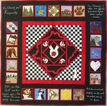
Here is Stephenie's Quilt:

You can see the post at Twilight Lexicon here and the entire transcript is here.

~~~

August 5, 2010

Eclipse Charity Quilt: Thanks for all the support

The Eclipse Give-to-Win is officially closed.  We'd like to thank everyone who has shown interest in our work and everyone who has donated.  We are proud of everyone involved in this project.  Together we raised $1729 for ALSF!!!  Stay tuned, the lucky winner will be announced August 10th. 

~~~

July 29, 2010

Eclipse Charity Quilt: The Finishing Touches

Ok, my last post was a huge essay....so I'm going to keep this one short and SWEET!  Here are the pretty pictures of the finished quilt, so you can see all the yummy quilting Angie did on it :clap:!

I took these photos outside with the morning sun at an angle, hoping to get that quilting to show up.  It was done with invisible thread, also called monofilament thread, so that it wouldn't interfere with the designs.  Not sure what brand Angie used, we'll have to do a post exploring the do's and don'ts of invisible thread sometime in the future :wink:.

It's a shame the camera still doesn't capture the full sparklingness of this quilt.  All the shimmery Fairy Frosts, rhinestones and beads, and thanks to that invisible thread, all the quilting sparkles in the sun! Mouse over the lower right corner for the controls to stop the slide show for a better look at the pictures.


Iris
~~~

July 22, 2010

Eclipse Charity Quilt: It's All in the Details

The most difficult aspect of this quilt was the ribbon. How can you mimic the Eclipse book cover ribbon with fabric? One that is interrupted by 20 blocks? The easiest way would have been to put the blocks together with sashing, mark up where the outline of the ribbon needed to go, cut out pieces from one color of red, and fuse them on. But then you get an outline of a ribbon, with no depth and the ribbon pieces really wouldn't form a coherent unified piece. Plus it would look like a tacky afterthought, even if it were stitched along the edges. I wanted the ribbon to look like part of the background, not slapped on top.

To achieve the look I was going for, I would need multiple shades of red in order to show that it is flowing and folding around, with lighter and darker areas. I started out by opening an image of the Eclipse book cover in Photoshop. I tried my hand with the pen tool, outlining the ribbon shape, but that still looked blocky. I then tried the magic wand tool, trying to select just certain color sections, but there are too many shades of the color in a high def image to easily select distinct sections.

And then the Photoshop Guru (my husband) gave me a tip that was an "aha" moment. He took one look at what I was doing one evening as we were watching TV on the couch together (I rarely watch TV without doing something else at the same time) and calmly said, "just Posterize it". I stared glassy eyed at him till he told me what it meant, we looked to see if my "inferior" Photoshop Elements version had it (so far it's been able to do everything that the super expensive CS version does), and we tried it out.

I tried to find an official definition/ tutorial on what it does, but everything out there sounds too complicated or tells you how to use it for other things. And I'm not going to make this post a Photoshop tutorial, it's going to be long enough already. Basically it takes your high quality image and reduces the number of different tones in your image. It makes it look more cartoon-like. So I went from the image on top, with who knows how many tones of red....to the image on the bottom, in which I specified I only wanted 4 tones. Three tones was too simple, didn't provide the depth I was looking for, and I didn't want to look for more than 4 different fabrics to use!

So then I went shopping! For Fairy Frost! Online at our favorite place to shop for FF, Mary Jo's, of course (the shops around here don't carry more than one or two colors). At first I tried doing this combination of reds: a mottled red batik (for the shadow – don't know what it's called) with Scarlet, Blood, and Pomegranate Fairy Frosts.

As you can see there just isn't enough contrast. There is no definition between the 3 Fairy Frosts. I went looking around again, searching locally and online, and even considered just dying some of the Snow (white) FF I had, but finally found a lighter pink color called Lipstick at Fat Quarter Shop. I cringed at the pinkness of it, but one thing I have found over the years is that I tend to not use enough contrast and things look washed out. So I rearranged colors and came up with a new quadruple: the mottled red batik with Scarlett, Pomegranate, and Lipstick Fairy Frosts.

The next challenge was piecing it into the background. At first I thought I would piece it with rectangle and half-square triangles into a "rough" ribbon. I even drafted it up that way in my design (see the second picture above). The fact that it wouldn't be a solid background, but would be in the sashing between 20 blocks and 20 quotes was an obstacle. There was no way around the fact that I would be making things more complicated needing to piece around the blocks and quotes. I couldn't think of how to piece it easily, but I did find a wonderful technique for piecing curves. Fiber artist Dale Fleming has a technique called "Pieced Curves So Simple" and I looked at this tutorial on HGTV to figure it out. I'd previously done regular piecing and paper piecing but this is a whole new method, and it was actually super easy. The curves come together nicely, it was the piecing between all the blocks and quotes that had me yanking hair out!

Here is a quick overview of how the curvy parts worked: I drafted up my design to scale in Photoshop, meaning the quilt was to be 58" x 62", and my design canvas size was 58" x 62". It made for a slow file to work with, but I didn't want to deal with scaling. I had the grid showing on the file and I went through and methodically printed a paper template for each 8" x 10" section that had ribbon on it. I pinned the templates on my design wall behind the prepped blocks and sections of black/grey background fabric sashing. (And if anyone knows a quicker way than manually hitting "print" and giving it the coordinates each time, let me know!) You can see that the ribbon is made up of paper.

Unfortunately I wasn't thinking ahead and did not take photos of the process, but I'll try to describe it as well as I can and include the couple of photos I have. For each section, I cut the separate template colors apart. I used the templates to cut each corresponding fabric, with a roughly 1/2" seam allowance. Then along the inner curve I clipped the seam allowance and folded it over the paper. Using a washable fabric glue stick I lightly tacked down the seam allowance to the back of the paper template. I then lightly ironed it so that it had a crisp edge. I placed the "outer color" (which has the paper template attached) on top of the "inner" color and tacked down just that seam allowance to the bottom color (you can see in this first photo that I've re-taped the two darker reds, cut the shape of the pink and already folded it over the paper template and tacked down to the reds).

Then I peeled off the top "outer color" from it's paper backing to get to the crisp folded edge, and sewed along that seam (in the 2nd photo). Then I removed the paper backing all together, and ironed to smooth it out. I basically "built up" each section this way.

It may sound complicated, and unfortunately I don't have a "tutorial" of my own photos, but it actually is no harder than paper piecing. You just have the extra steps of cutting your pieces into a curves, clipping the seam allowances, and gluing the fabric around the edge of the paper before sewing them together.

This fourth picture shows a clipped edge already sewn onto the reds/pink with the paper removed.

To re-cap the process: I started with an image of the ribbon, I made it into a "cartoon" with only four shades of color . . . and this is the end result:

July 20, 2010

Eclipse Charity Quilt: The beginnings

As we come upon the last two weeks of our Donate to Win fundraiser for Alex's Lemonade Stand, I thought it would be fun to share with everyone some more details about this one of a kind quilt and how it came about.  If you've been reading our blog for some time you'll know that we all met just last winter/spring and in just one year we've been busy with several group projects, all through online and mail collaboration.  The first big one was the quilt we gifted Stephenie Meyer (spring/summer '09) and then our first for charity project, the New Moon Quilt (fall '09).  In February we started planning our third "big" project, also for charity and on our TwilightMOMs Eclipse Charity Quilt thread we opened a call for designs.   Eclipse is my favorite of the "published" books in the Saga, and immediately I felt inspired to make a design for the quilt.  I had seen a small wall hanging quilt in a magazine that looked nothing like I wanted, but had the suggestion of a ribbon running around blocks and felt that a ribbon had to be incorporated somehow.

My first attempt looked like this--------------------------------->
But I wasn't satisfied with how blocky it was, and no matter how much I played with the "ribbon", made up of rectangle and half square triangle pieces, I couldn't get it to look right.
But having everything revolving around a central Eclipse was something that I liked.


In the previous two quilts, it frustrated me that we had to narrow down to only a couple of quotes.  But this done for good reasons: one they were embroidered, so they had to be big enough to be feasible; and two the blocks were the star of the show.   But I love Stephenie's characters and so much of what they say.  If I could, I'd have the whole Saga quoted on my walls!  Recently I've been experimenting with printing on fabric, both the "printable fabric" you can buy, and making my own, and I thought this would be a great way to incorporate more quotes since they can be smaller and still be legible.

<----I have an Edward Cullen fan-made calendar that has this page I really like.   As a scrapbooker, having the scenes shown as labeled "polaroids"  seems so fun to me.  And it's a way to incorporate those quotes I so desperately love.

So I thought, why not make the whole quilt look like a scrapbook page: the Eclipse book cover as the "background"; the appliqued Eclipse as an "embellishment"; the blocks as the "photos"; and the pertinent quotes as the "journaling".  Here was attempt#2 -------------------->

They were the only designs submitted by our deadline and we put them up for vote.   Someone suggested changing the polaroid effect for a framed photo with a separate jouraling tag under each, which has a much cleaner, sophisticated look.  And thus the design evolved to this (with temporary "sample" blocks):

Check back tomorrow to see how the ribbon evolved from something blocky to the flowy ribbon on the Eclipse cover.
(and for some good Photoshop tips!)

Iris

~~~~

July 10, 2010

Eclipse Charity Quilt: Help Us Spread the Word

No doubt, you've seen the movie by now and so you're more excited than ever about getting a chance to win our Eclipse quilt! We donated our time, talents and materials to create this quilt in order to raise money for Alex's Lemonade Stand Foundation, a charity close to the hearts of the Twilight Fandom. We're collecting donations for ALSF and in addition to your donation (for which we are very grateful), you can also help us by spreading the word! Blog about our quilt and grab one of our buttons to display in your sidebar.

Small Button - 150 pixels wide

Eclipse Give-to-Win Quilt


Large Button - 220 pixels wide

Eclipse Give-to-Win Quilt


We are accepting donations through August 1, 2010 and the winner will be announced on August 10, 2010.

If you blog about us or even just display our button, leave us a comment with a link to your blog and we'll stop by and visit you!

June 3, 2010

Presenting: The Eclipse Give-to-Win Charity Quilt

We've given you a little preview of this special one of a kind Eclipse quilt we've been working on, and now it's time for the grand reveal!
Eclipse Quilt,Iris

This special quilt is being given away to support Alex's Lemonade Stand Foundation, a charity close to the hearts of the Twilight Fandom. See Peter (the embodiment of our beloved Dr. Carlisle Cullen) Facinelli's promotional video for ALSF below.

Give to win? How does this work? Simple! Donate $5 to ALSF through our PayPal button here on the blog or on the Eclipse charity Give-to-Win page and you’ll get a chance to win this original, one of a kind beauty.

This is a once in a lifetime opportunity for any Twilight Saga fan! A handmade, Eclipse themed quilt made by the members of the TQC, and just in time for the movie release! To make it extra special, the quilt has 3 autographs from the saga's actors: Peter Facinelli (Carlisle Cullen), Chaske Spencer (Sam Uley), and Daniel Cudmore (Felix)! For every $5 increment donation, you get a chance to win. Give $5, get 1 chance; give $20, get 4 chances, etc. (so the more you give, the more chances you get to win!). Donations will be accepted from June 4, 2010 until August 1, 2010. The winner will be announced on August 10, 2010. We promise to not share your personal info with any other party. Your name will be posted on our website if you are the winner, but nothing more. So remember to make sure your contact info is correct in your PayPal account so we can contact you if you win. Please give generously! And who knows? You might have this gorgeous quilt in your hands!

Twilight Quilters Coven
Angie, Cat, Elizabeth, Iris, Jerri Lynn, Joyce, Kate, Mel and Wanda